Your resume is one of the most important tools you have when it comes to finding a job. Not only must you make sure that your resume is well-written, professional, and error-free but using good resume fonts is key to making a good first impression and selling yourself to potential employers. When it comes to resumes, there are a lot of different opinions out there on what font is best. Some people swear by using simple, easy-to-read fonts like Arial or Times New Roman, while others prefer to get a little more creative with their resume font choices.
There are a few things to keep in mind when choosing a font for your resume. You want to make sure that the font is easily readable. This means avoiding any fancy or decorative fonts that might be difficult for a hiring manager to read. One way to set your resume apart from the rest is to pay attention to the font. The right font can make your resume more readable and easier on the eyes, while the wrong font can make it look unprofessional or even difficult to read.
With all that in mind, here are some of the best and worst fonts to use on your resume, as well as some examples of how to use them effectively.
What is a Font?
A font is a typeface that is used in typesetting and printing. It is a collection of characters that share common design features and are usually sold together as a typeface. Fonts are used to create typefaces, which are then applied to various objects like papers, websites, books, and other printed materials.
There are two main types of fonts: serif and sans-serif. Serif fonts have small lines or strokes attached to the ends of the main strokes in a character, while sans-serif fonts do not have these lines or strokes.
Why You Need a Good Resume Font
While there are a lot of different fonts out there to choose from, not all of them are created equal. Some fonts are more appropriate for certain industries or jobs than others. For example, if you’re applying for a job in a creative field, like graphic design or advertising, then using a more creative font may be seen. When it comes to your resume, using a good font is essential for two reasons.
- First, a good font will make your resume easier to read, which is important when you’re trying to stand out from the competition.
- Second, using a unique or interesting font can help to set your resume apart from the rest and show that you’re creative and professional.
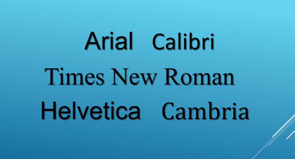
Best Fonts for Resumes:
Arial
Arial is a sans-serif font that is widely used in both print and digital media. It was designed in 1982 by Robin Nicholas and Patricia Saunders. Arial is a versatile font that can be used for both body copy and headlines.
Some good things about the Arial font include its versatility and its easy-to-read letters. Arial is a great choice for Resumes, Cover Letters, and even some types of Business Documents. Another great thing about Arial is that it can be used in a wide variety of applications, including Microsoft Word, Adobe Photoshop, and even some types of web design.
If you are looking for a Resume or a well written Cover Letter Font that is easy to read and has a clean look, Arial is a great choice.
Calibri
Calibri was designed in the early 2000s by Luc(as) de Groot, a Dutch typeface designer. The font was created as an update to the popular sans-serif font, Arial. Calibri was first released in 2007 and quickly became one of the most popular fonts for both body copy and headlines. Calibri is another sans-serif font that is popular in both print and digital media. It is a modern, stylish font that can be used for both body copy and headlines. Calibri is a good choice for a resume because it is easy to read and has a clean, professional look.
Times New Roman
Times New Roman is a serif font that was designed in the early 1900s by Stanley Morison. Morison was a British typographer who wanted to create a new printing typeface that would be easier to read and more efficient to print. Times New Roman was first used by The Times newspaper in London and quickly became popular in both print and digital media. Today, Times New Roman is still one of the most popular fonts for both body copy and headlines. It is most commonly used in print media. It is an easy-to-read font that is perfect for long blocks of text. Times New Roman is a good choice for a resume because it is professional and easy to read.
Helvetica
Helvetica was originally designed in the 1950s by a Swiss typeface designer named Max Miedinger. It was created as a response to the popular sans-serif font, Akzidenz-Grotesk. Helvetica quickly became popular in both print and digital media. Today, it is still one of the most popular fonts for both body copy and headlines. Helvetica is most commonly used in print media. It is also an easy-to-read font that is perfect for long blocks of text.
Cambria
Cambria is a serif font that was designed specifically for digital media and so is most commonly used in print media. It is also a good choice for a resume because it is professional and easy to read.
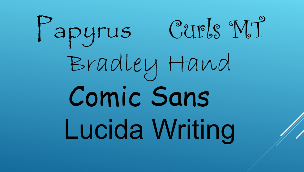
Worst Fonts for Resumes:
Papyrus
Papyrus is a serif font that was designed in the early 1990s by Microsoft. It was originally designed as a casual, hand-drawn font for use in children’s documents. However, Papyrus quickly became popular in both print and digital media. Today, it is one of the most popular fonts for both body copy and headlines. Papyrus is most commonly used in print media. However, because Papyrus is a casual, hand-drawn font, it is not considered to be a professional font. It is a decorative font that is often used in invitations and other formal documents. Therefore, it is not a good choice for a resume because it can be difficult to read and looks too casual.
Curlz MT
Curlz MT font is an ornamental, decorative font that should be avoided when writing a resume. Curlz is a script font that was designed in the early 1990s by Microsoft. It was originally designed as a casual, hand-drawn font for use in children’s documents. Today, it is one of the most popular fonts for both body copy and headlines. Curlz is most commonly used in print media. However, because Curlz is a casual, hand-drawn font, it is not considered to be a professional font. It can appear unprofessional and make it difficult for the reader to take the content seriously. Therefore, it is not a good choice for a resume.
Bradley Hand
The Bradley Hand font is a script typeface that is not recommended for use on resumes. This is because it can be difficult to read, and may give the impression that the applicant is not taking the job application process seriously.
Comic Sans
Comic Sans is a casual, playful font that is most commonly used in children’s books and websites. Comic Sans is a sans-serif font that was designed in the early 1990s by Microsoft. It was originally designed as a casual, hand-drawn font to be used in comic books and children’s documents. Because Comic Sans is a casual, hand-drawn font, it is not considered to be a professional font. Therefore, it is not a good choice for a resume.
Lucida Handwriting
Lucida Handwriting is a script font that is often used in invitations and other formal documents. However, it is not a good choice for a resume because it can be difficult to read and looks too casual.
How to Use Resume Fonts Effectively:
If you’re applying for a job that is creative in nature, you may want to use a more creative font like Papyrus or Curlz MT. Just be sure that it is still legible and easy to read. If you’re applying for a job that is more traditional, you may want to stick with a classic font like Arial or Times New Roman. If you’re having trouble fitting everything you want to say onto one page, you may want to use a smaller font size like 10 or 12 point. Just be sure that it is still legible.
How do I choose the right font for my resume?
When choosing a font for your resume, it is important to choose a font that is easy to read and looks professional. Arial and Times New Roman are both good choices because they are both classic fonts that are easy to read. If you want to use a more creative font, just be sure that it is still legible. The best way to choose a font is to experiment with different fonts and see which one looks best on your resume.
When choosing a font for your resume, there are a few things to keep in mind.
- Firstly, you want to make sure that the font is easy to read and doesn’t contain any fancy or decorative elements that might be difficult for a hiring manager to read.
- Secondly, you want to choose a font that is professional and reflects your personal brand.
- Finally, you want to make sure that the font is compatible with the type of document you’re creating.
Some of the best fonts to use on your resume include Arial, Times New Roman, Calibri, and Verdana. These fonts are easy to read and are compatible with most word processors. If you’re looking for something more creative, try using fonts like Pacifico or Georgia. These fonts are still professional but have a more unique look that can help you stand out from the competition.
Whatever font you choose, make sure that it is easy to read and looks professional. You don’t want your resume to look like it’s from another era or difficult to understand. Using a good font will help ensure that your resume looks its best and makes the best impression possible on potential employers.
Summary
So what can we say is the best font to use on a resume? It really depends on the job you’re applying for and your personal preferences. In Conclusion, just be sure that whatever font and size you choose, is legible and easy to read.
Keep these tips in mind when choosing a font for your resume.
Q: What is the best font to use on a resume?
A: There is no one “best” font to use on a resume. The best font for your resume will depend on the type of job you are applying for and your personal preferences. However, some fonts are more commonly used than others. Some of the most popular fonts for resumes include Arial, Times New Roman, and Helvet
Q: How do I choose the right font for my resume?
A: When choosing a font for your resume, it is important to choose a font that is easy to read and looks professional. Arial and Times New Roman are both good choices because they are both classic fonts that are easy to read. If you want to use a more creative font, just be sure that it is still legible. The best way to choose a font is to experiment with different fonts and see which one looks best on your resume.
Q: What are some of the most popular fonts for resumes?
A: Some of the most popular fonts for resumes include Arial, Times New Roman, and Helvetica. These fonts are all easy to read and look professional.
Q: What should I avoid when choosing a font for my resume?
A: You should avoid using a font that is difficult to read or looks too casual. Comic Sans is a font that you should avoid because it can be difficult to read and it does not look professional. Lucida Handwriting is another font to avoid because it can be difficult to read and looks too casual.